- Client
- Arctic Edge · 2024
- Role
- UI Designer
- Scope
- Mobile app redesign
- Status
- Delivered
Arctic Edge:
redesigning the
smart ice bath app.
Arctic Edge makes smart ice baths. Their existing companion app worked, but read as cluttered. Competing surfaces, decorative colour, and a temperature display that was hard to read at a glance. The brief was a redesign so the people using the tub could operate it without thinking about the app.
A hardware app
inside a third-party
shell.
Arctic Edge ships smart cooling tubs with a companion mobile app. The app runs inside the Tuya smart-device platform, so an operator pairs the unit, opens the app, and lands on the control surface for that specific tub. The redesign covered everything inside that device screen.
The platform constraint was Tuya. The app account, the device pairing flow, the back-to-list navigation: all inherited from Tuya’s smart-home stack and not mine to touch. Anything past the device screen, I owned.
I worked with the Arctic Edge product team on scope and screen inventory. The hardware team set the operator controls (ozone, deviation, fan speed) that the settings screen needed to expose.
What the legacy
app got wrong.
Reading the existing home screen as a UI artifact, six issues stood out:
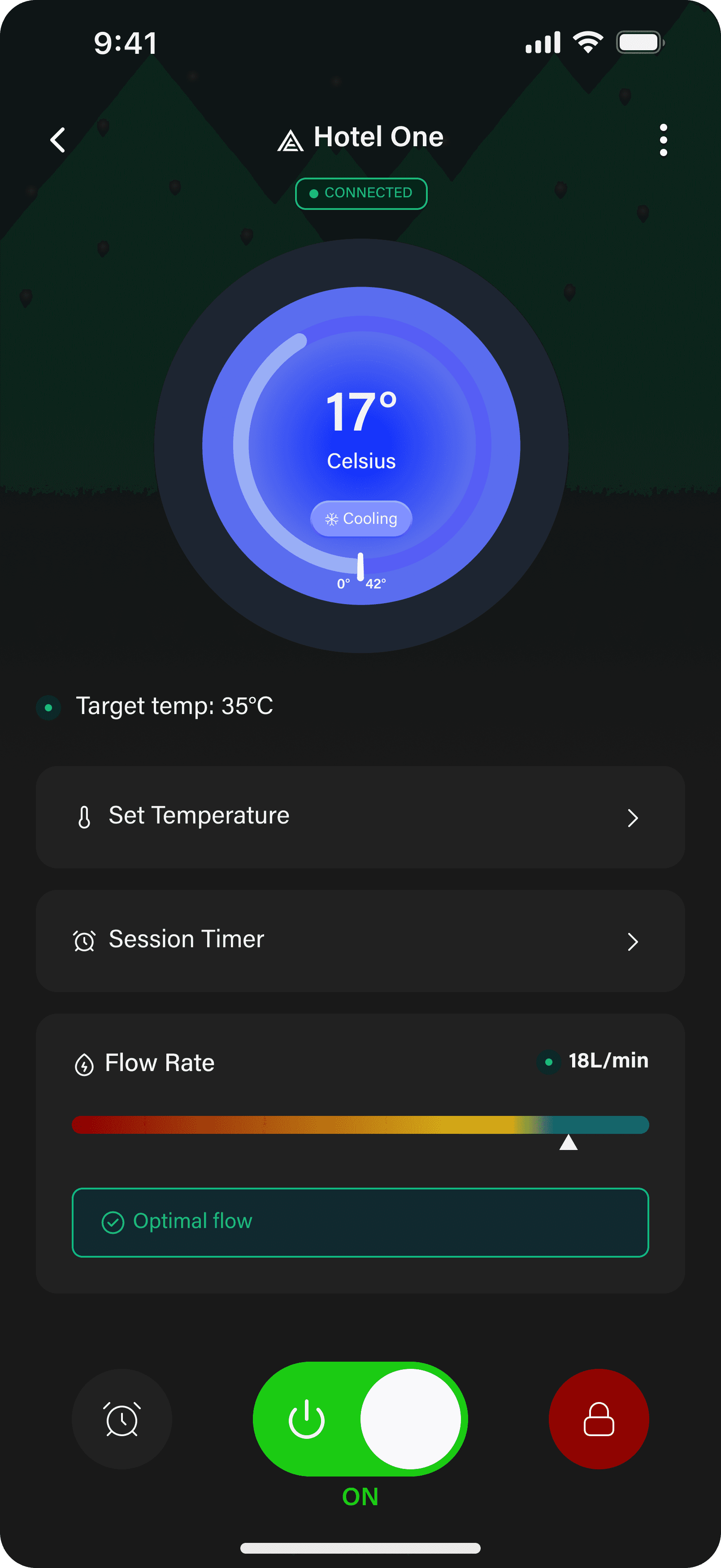
- The temperature was the most important number on screen, set inside a 3D ice-sphere graphic. The texture fought the digits. You had to look twice to read a value you should read in a glance.
- There was no system state. No connection indicator, no cooling-or-heating mode badge. The only “OFF” cue was a button label.
- Flow rate was a bare value. A number with no visual reference for whether it was healthy or degraded.
- Hierarchy was flat. A white timing-control pill, a lock icon, an OFF circle, and a power button all carried similar visual weight. Nothing said which action was primary.
- Colour was decorative, not functional. A teal gradient sat unchanged across every state.
- Casing varied screen to screen. SET TEMP, Current Temp, Factory setting, USER SETTING. Four conventions on one screen.
From the audit, two things had to be fixed first. The temperature needed to be unmissable. The system state needed to be visible without tapping. Everything else followed.
One home screen.
Three levels of
hierarchy.
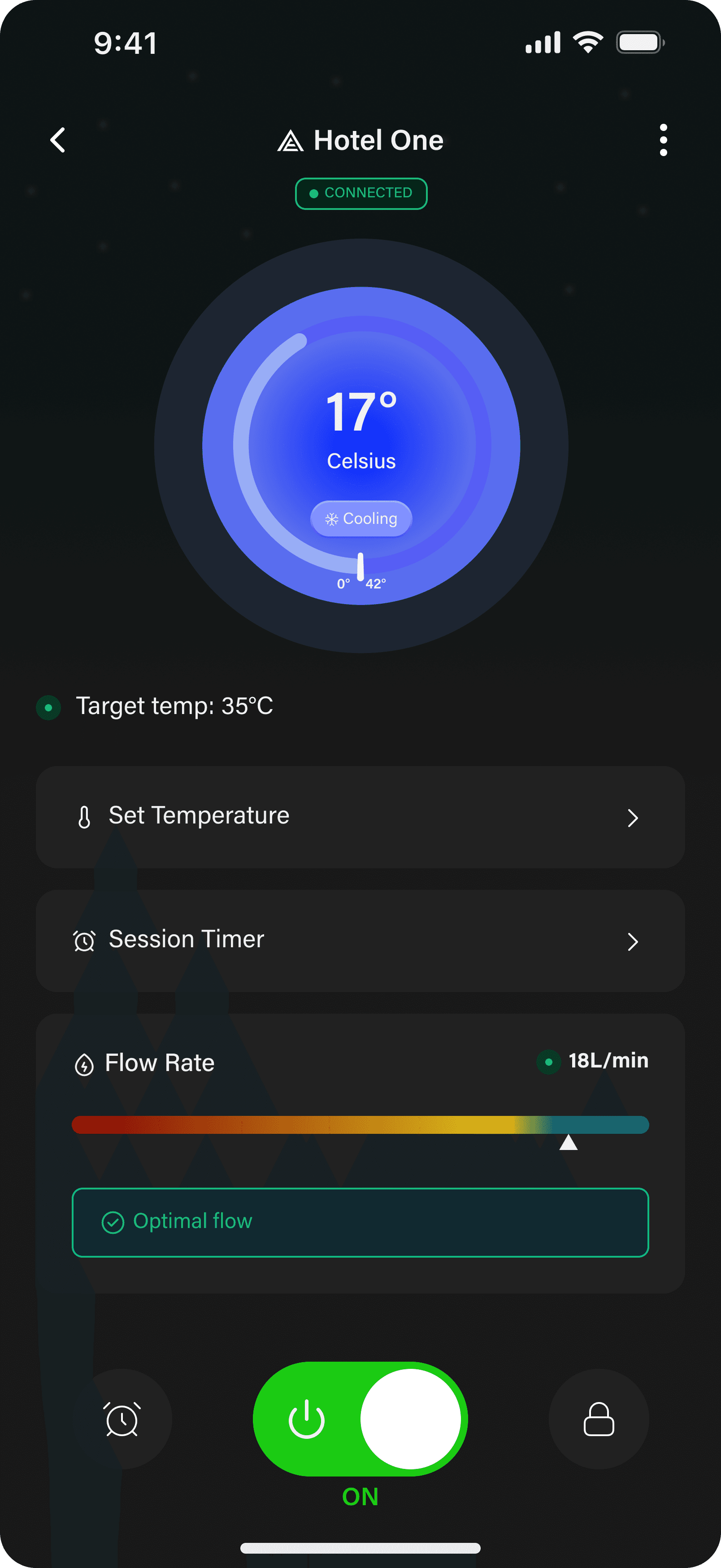
The home screen carries the entire active experience. Every recurring control is reachable without scrolling, organised into three visible tiers:
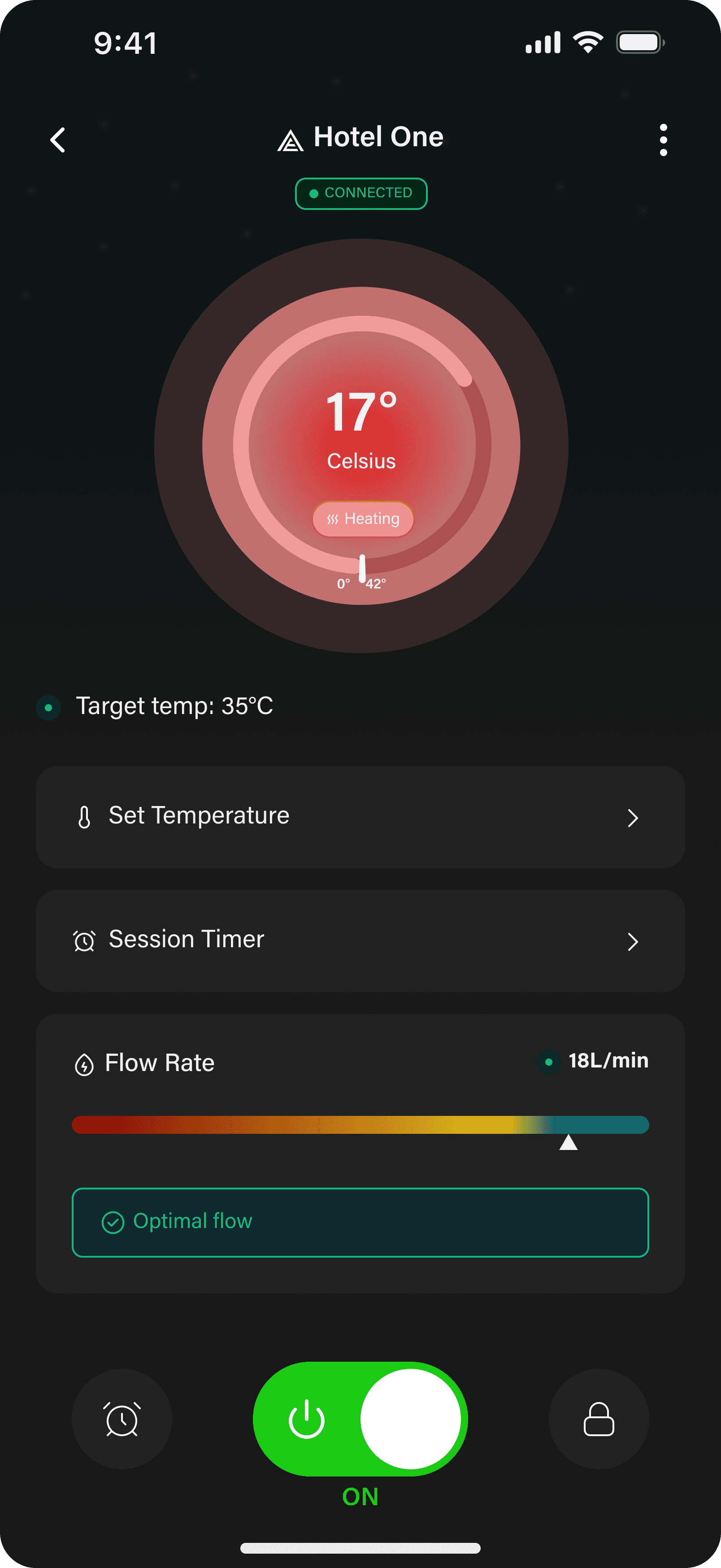
- Temperature dial. The current reading sits in display weight at the centre of a circular ring, with the unit underneath in a quiet sans. The ring carries the state colour and a thin tick at the target. Scale marks (0° and 42°) sit on the arc as a quiet reference.
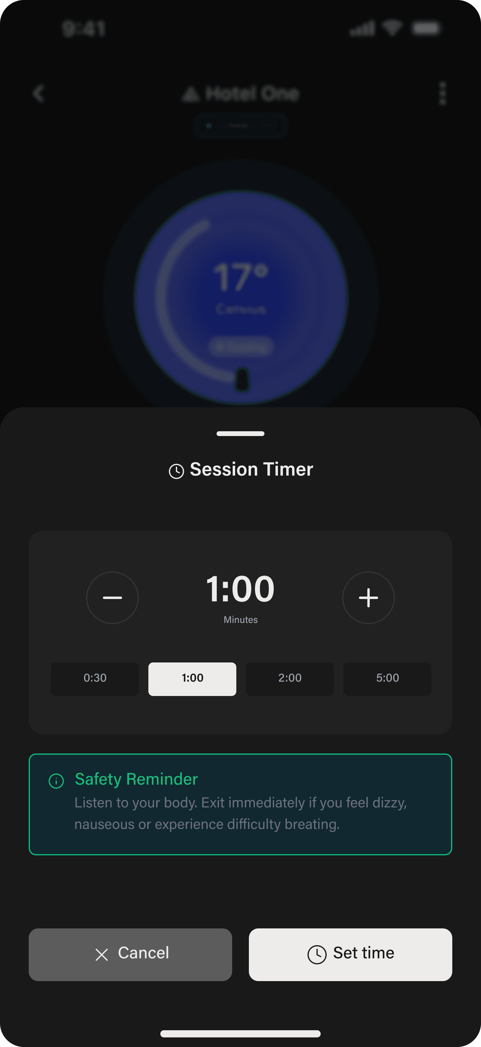
- Settings rows. Set Temperature and Session Timer collapse into chevron rows under the dial. Common shape, common interaction; each row opens a bottom sheet.
- System dock. Bottom row: schedule, the power toggle as the visual centre, and the lock. Same pill shape, equal weight. Power gets the bright accent because it is the only action that is both primary and immediate.
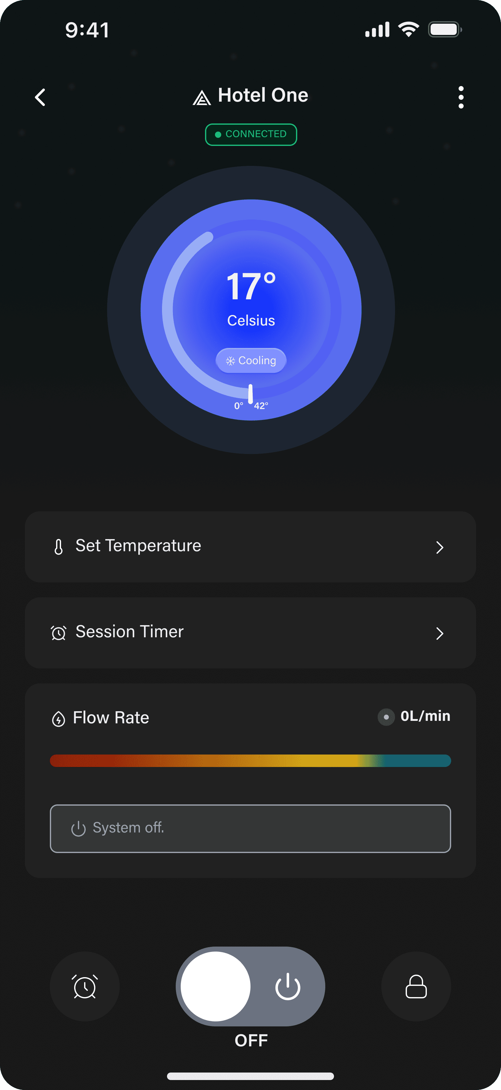
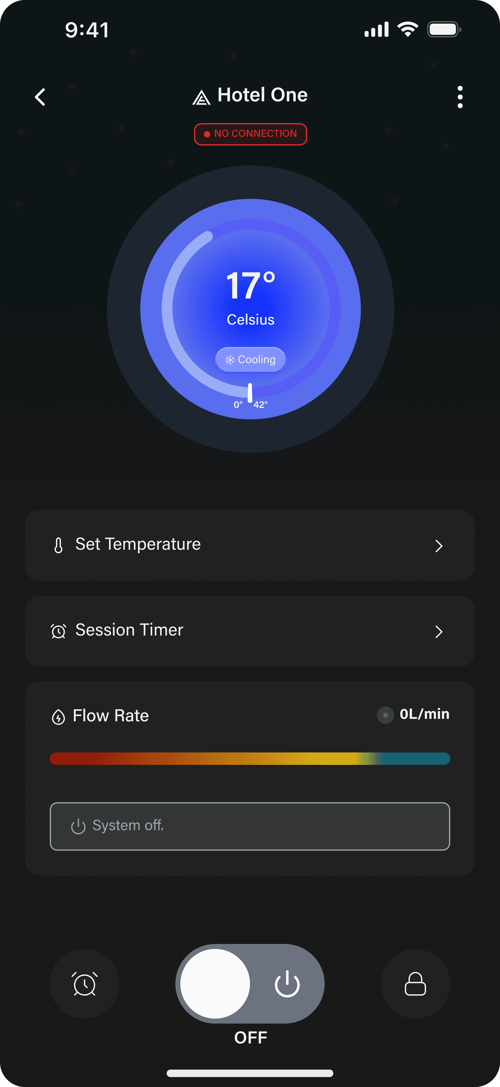
Colour does work. Blue ring for cooling, red ring for heating, dim grey when off, green for active power and verified states (connection, optimal flow). A small palette, applied to state and never as chrome.
Typography is restrained. One sans family does most of the work, and the display weight is reserved for the temperature itself, which makes the number read as the primary object on the screen.
Every irreversible
action wears the
same shape.
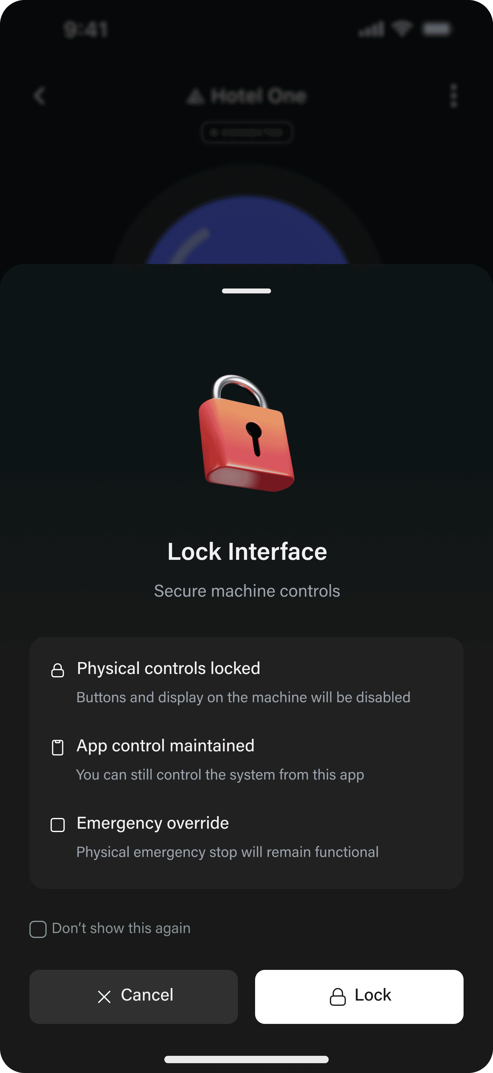
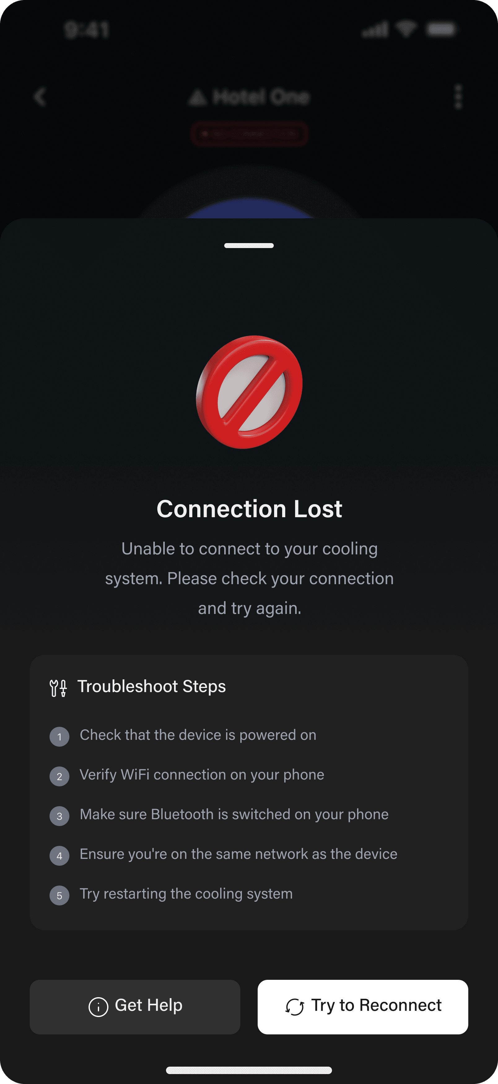
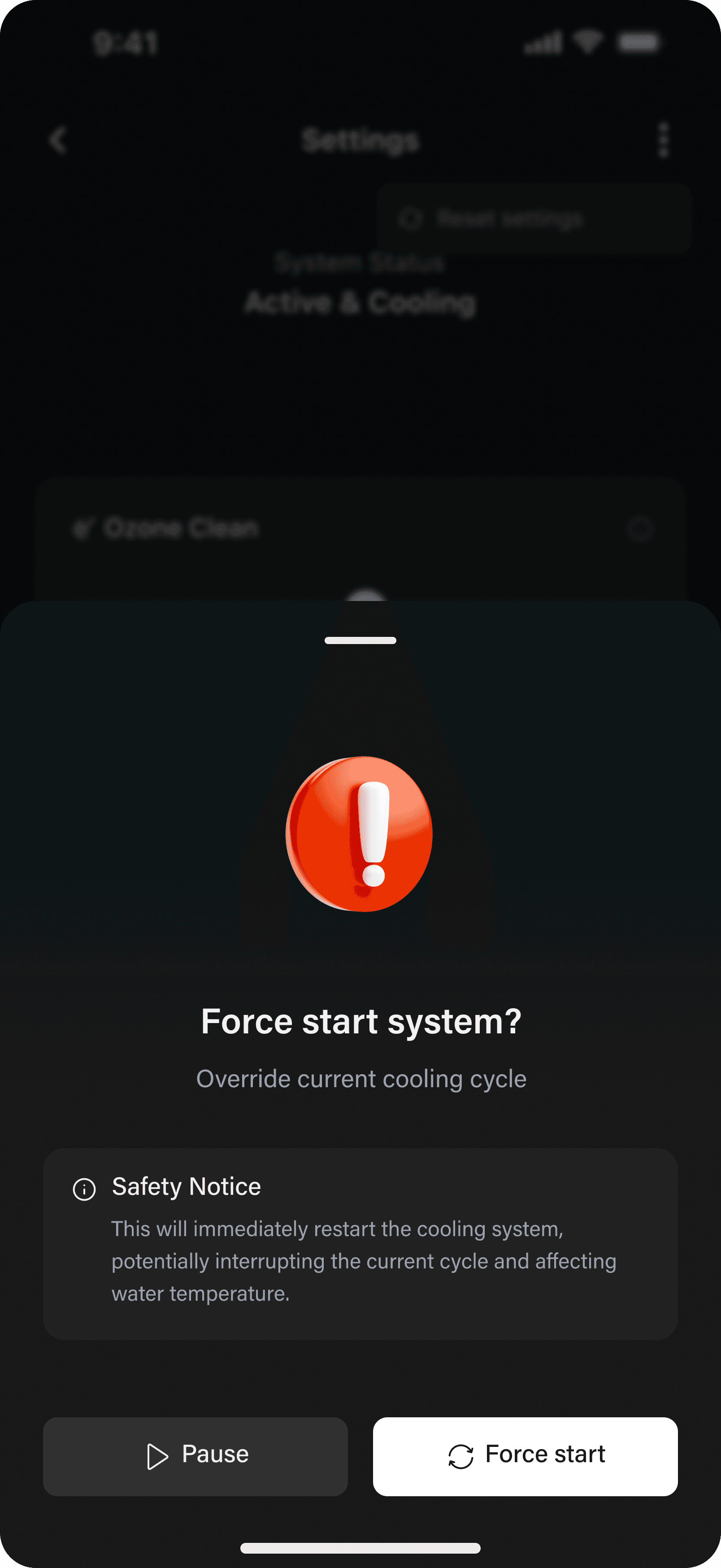
Five different bottom sheets share the same anatomy: lock, force start, system off, connection lost, and session resume. Each is built from four elements:
- An iconographic mark (lock, exclamation, shield, slash), sized to read as a state and not a decoration.
- A short title that names the action being confirmed.
- A one-sentence consequence statement.
- Two actions, never one. Cancel and the committed action, or Get Help and Try Again.
Force Start is the most aggressive sheet in the system. Bright red exclamation, a dedicated Safety Notice callout, and Pause / Force Start in opposite weights. The warning glyph is the loudest red in the app, but the committed Force Start button stays a neutral white so the visual weight sits on Pause, not on the destructive action.
Connection Lost replaces the cooling animation with a numbered troubleshoot checklist: power, Wi-Fi, Bluetooth, network, restart. The recovery flow has no spinner, only the checklist and the two recovery actions.
One dial,
two zones.
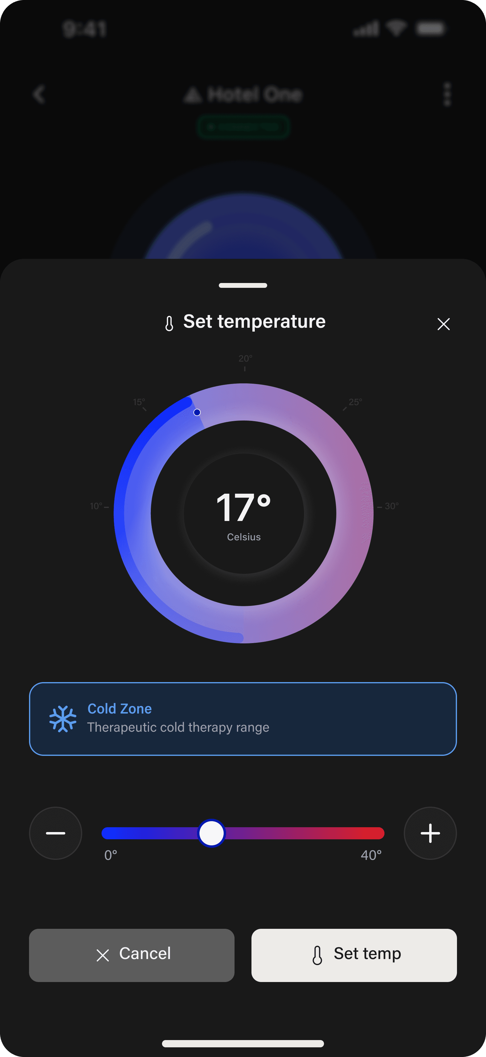
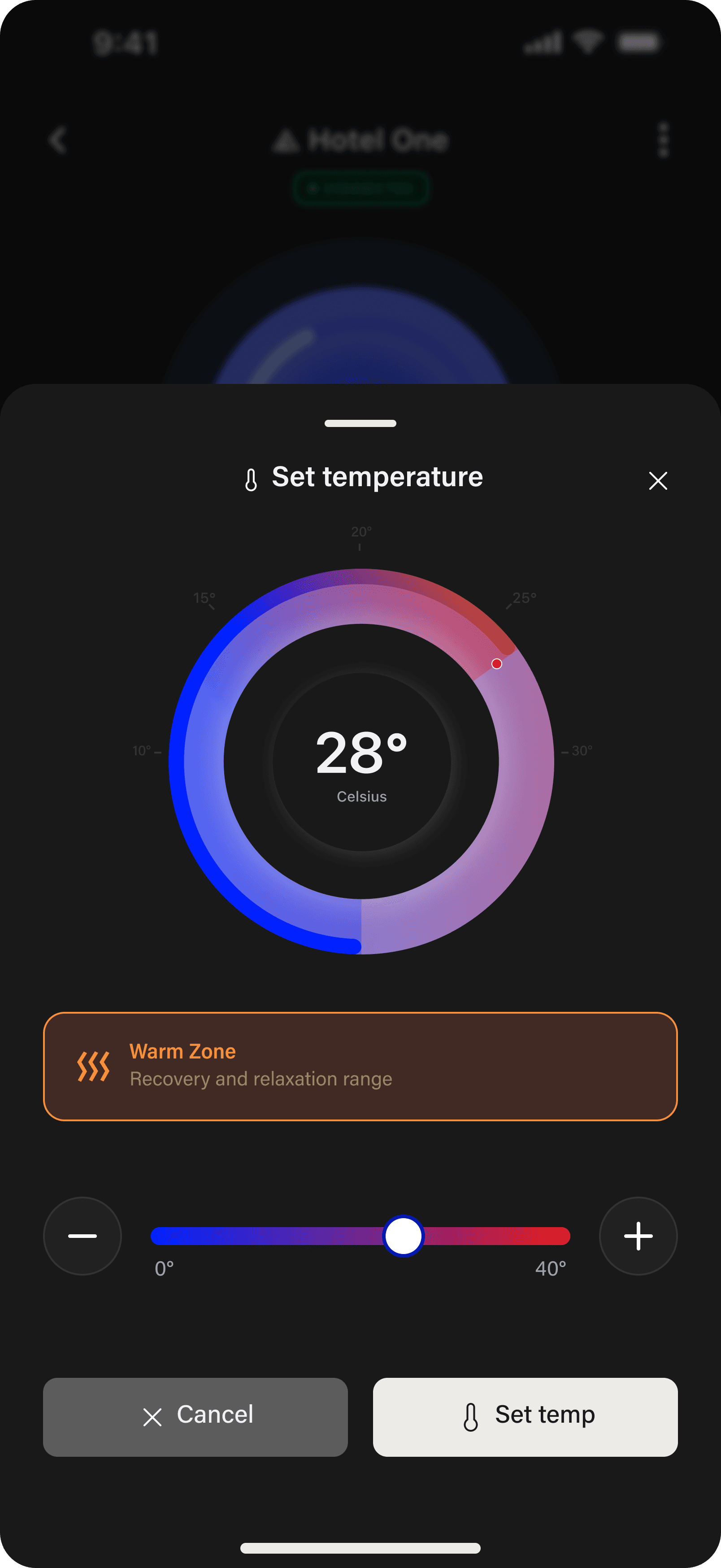
Set Temperature opens a sheet that mirrors the home dial. Below 25°C the gradient sits cold (blue into magenta, snowflake glyph, blue tint on the zone card). Above 25°C it warms (orange into red, wave glyph, amber tint). The dial, the plus and minus, the slider, the Set Temp action: all the same. Only the colour and the zone-card content change with the value.
Two recurring
flows, two surfaces.
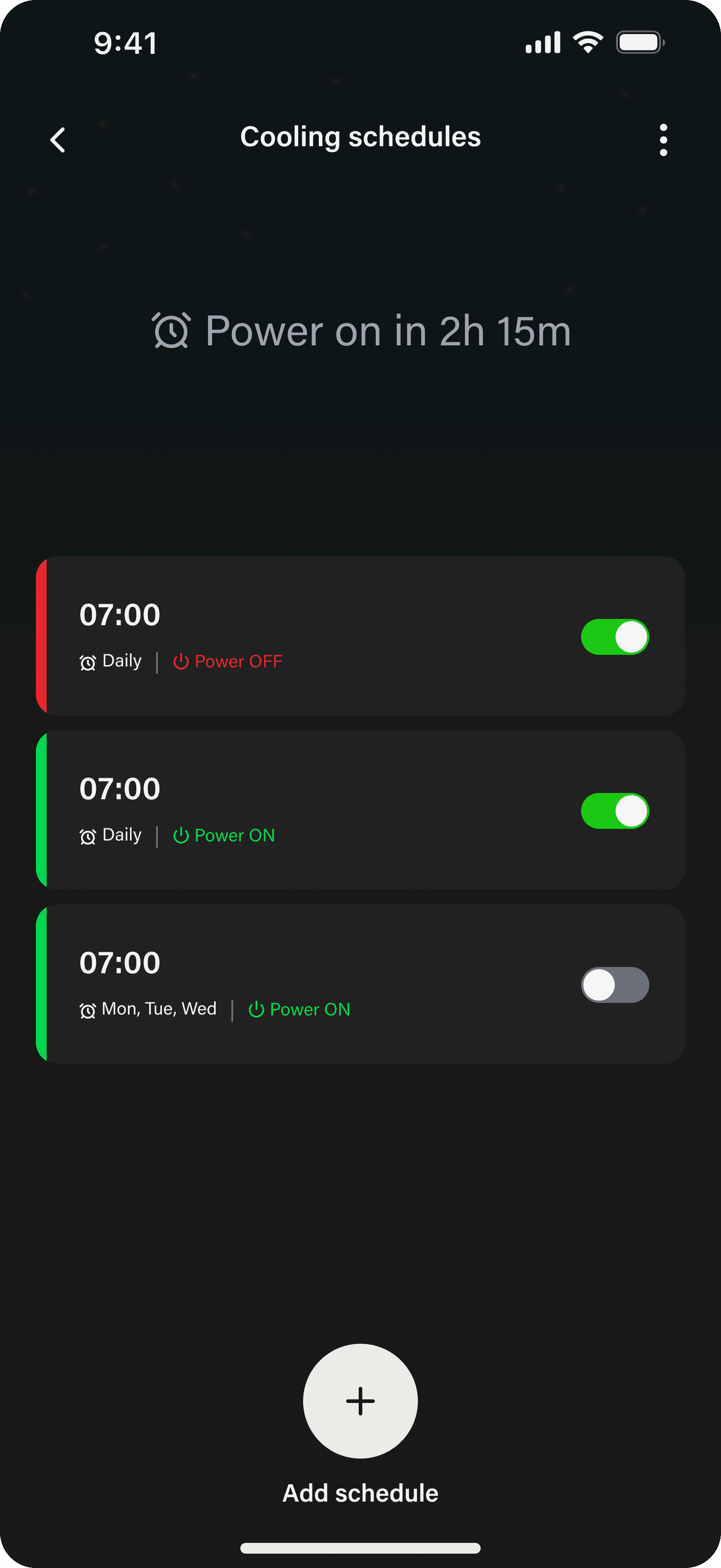
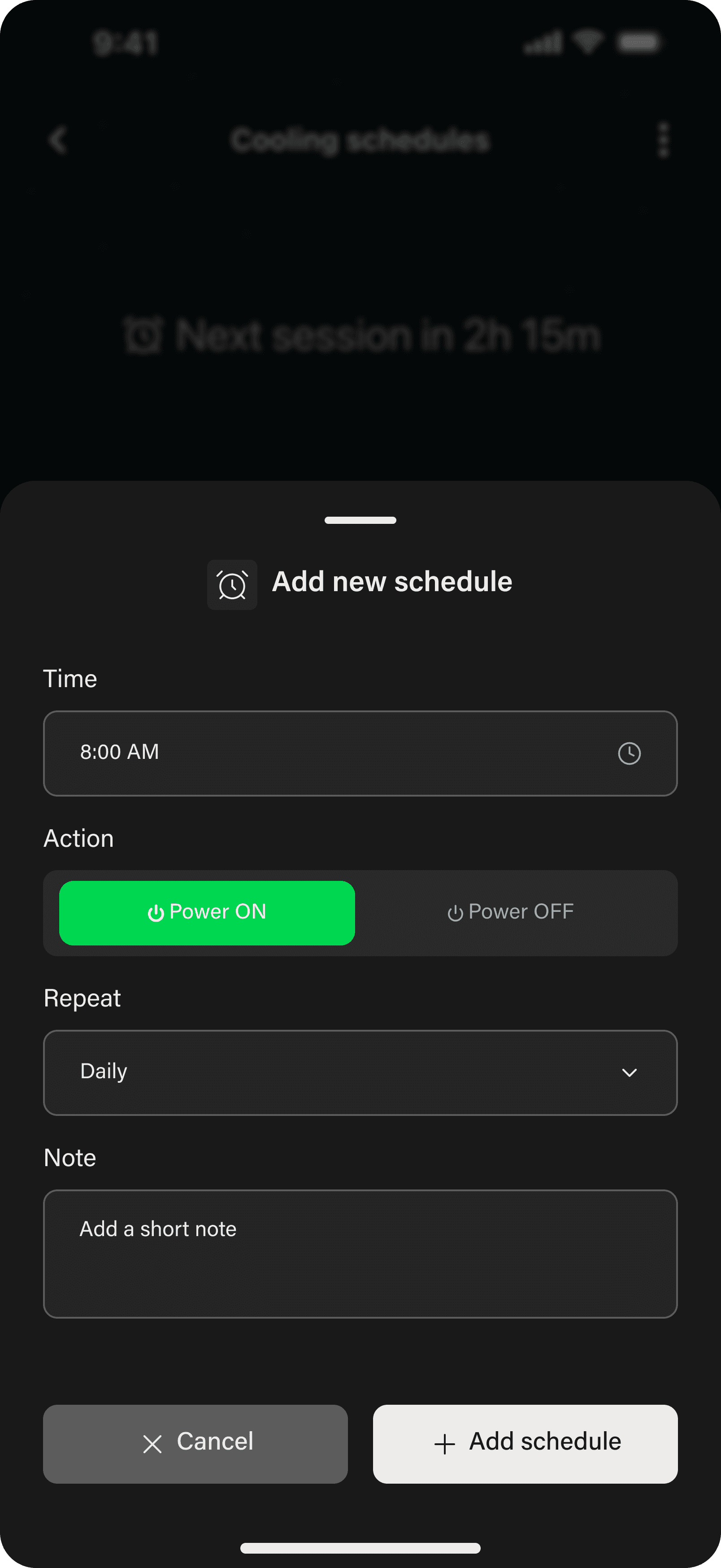
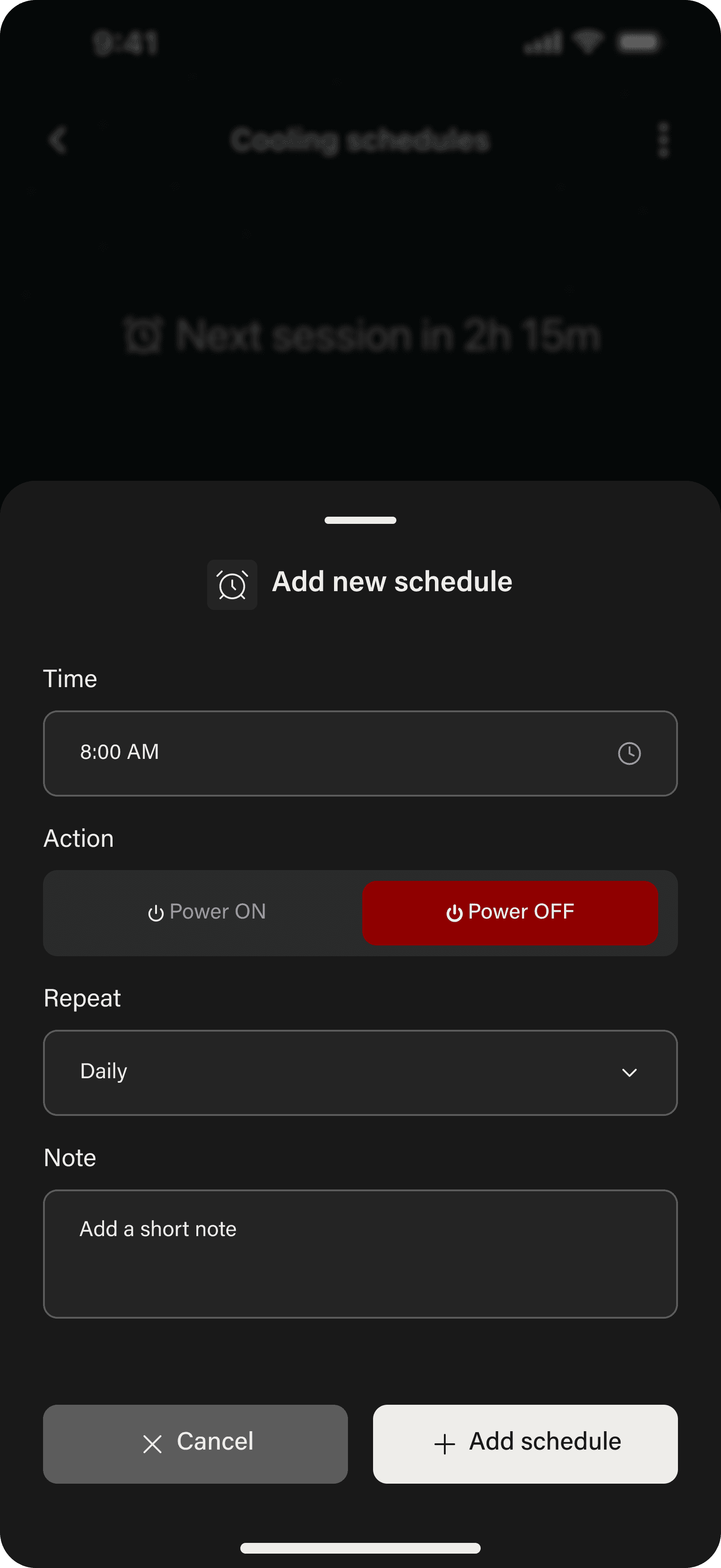
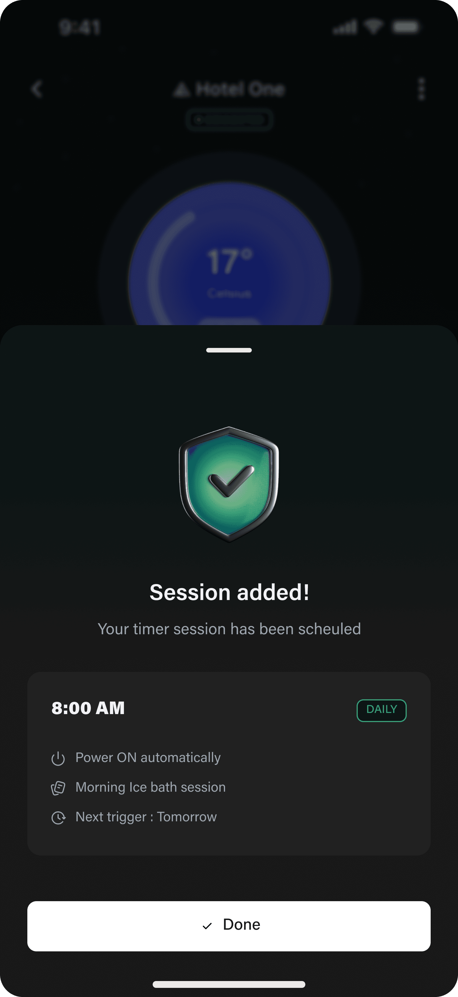
Cooling Schedule is a vertical stack of timer cards. Each card carries a coloured left edge (red for Power OFF, green for Power ON), so the list reads as state without parsing. Add a schedule, pick the time, pick the action, pick the repeat pattern, add an optional note, confirm. Five fields on one bottom sheet, no nesting.
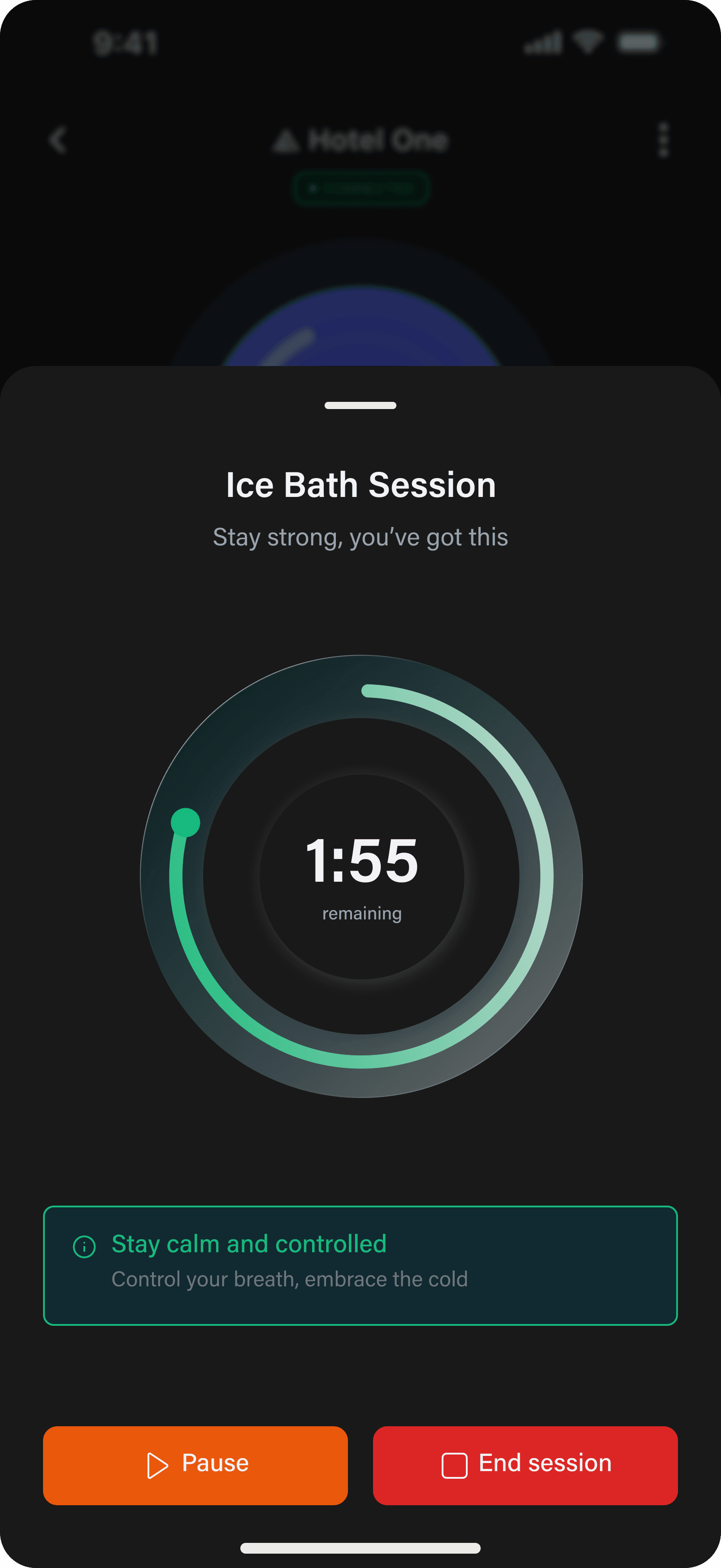
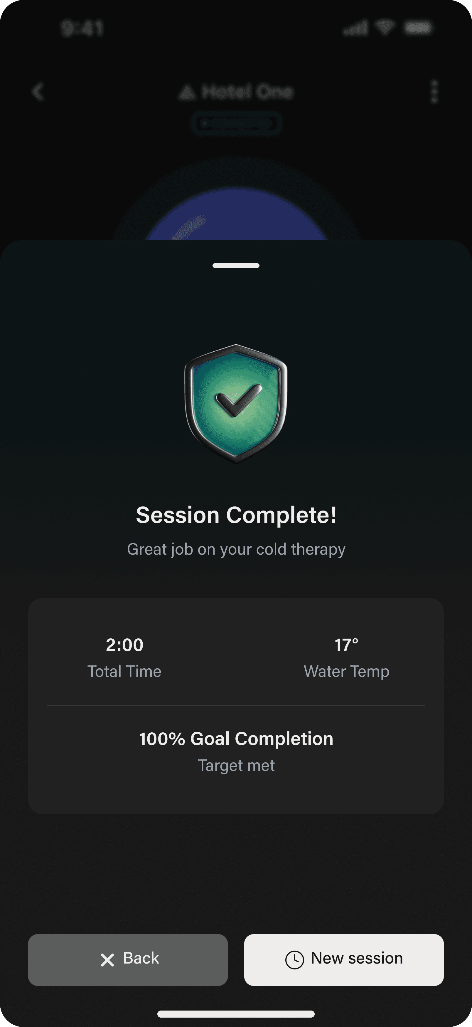
Session Timer is a different surface. Once a session is running, the temperature dial recedes and a green circular timer takes the centre. A single line of guidance copy holds the bottom (“Stay calm and controlled.”), and the only actions are Pause and End. The post-session summary returns total time, water temperature, and goal completion.
The screen
behind the menu.
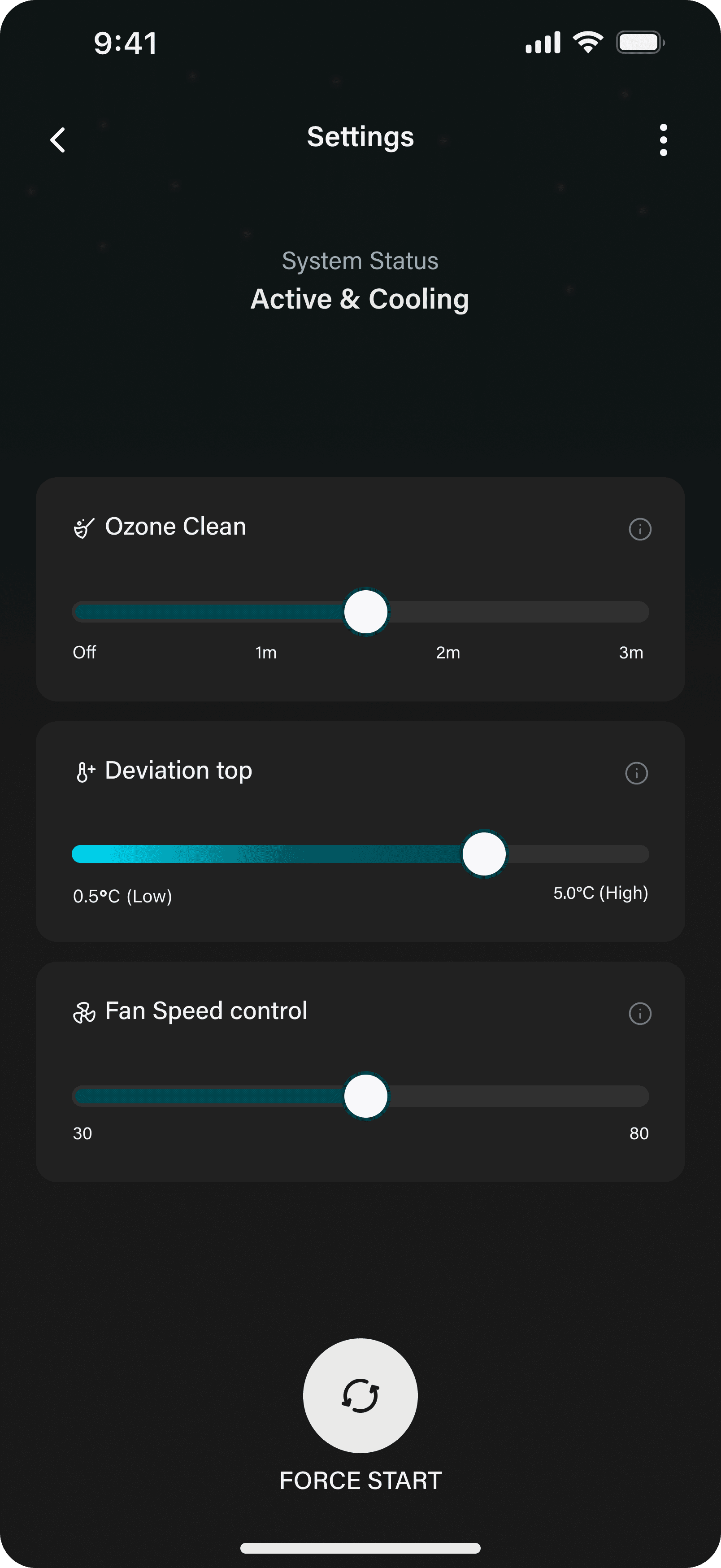
A separate Settings screen sits behind the kebab menu, not on the home. Three operator controls (ozone cleaning cycle, deviation tolerance, and fan speed) each render as a labelled slider with min and max anchors. Force Start sits at the bottom, behind the same two-step warning pattern. This screen is built to be findable on demand, not to take attention by default.
The seams I’d
tighten.
The system works because the home screen does. Once the current temperature and the system state are answered on one surface, every other screen gets easier to design against.
What I’d change. The home dock has three pill controls and none of them are labelled. I suspect a first-time user finds the lock slower than the temperature, and quiet labels under each control (or a one-second reveal on first launch) would close that gap. The Tuya pairing flow that wraps the app is also a different visual world from the Arctic Edge surface inside it. A future version would move more of the entry experience into a fully owned wrapper, so the visual language does not shift between pairing and use.