- Client
- Dexla · 2024
- Role
- UX Designer
- Team
- 2 designers (with Toba)
- Status
- Shipped · Documented
Dexla:
from a logo
to a system.
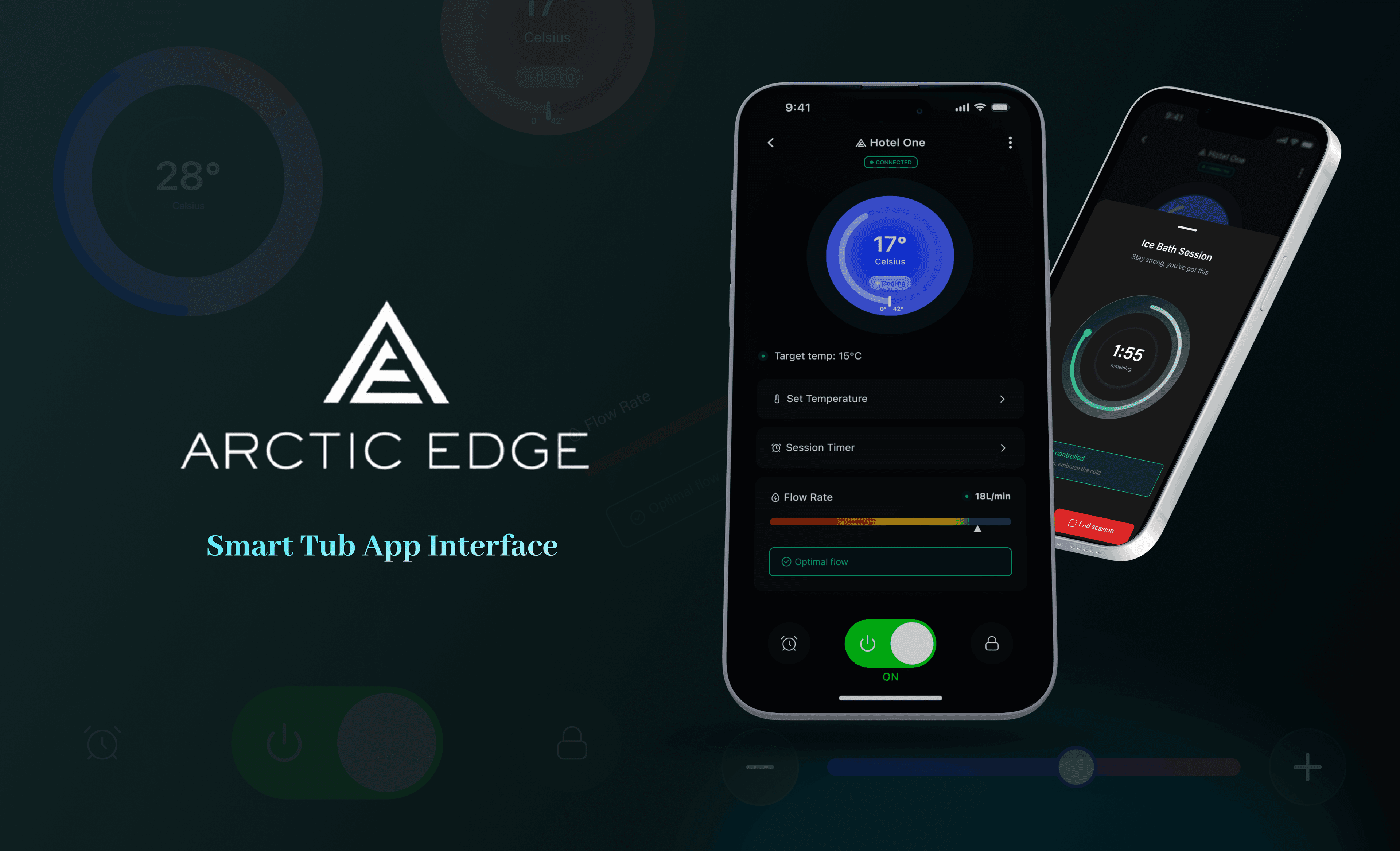
Dexla is an AI-powered no-code app builder for technical and non-technical users. When I joined, the brand was a logo. By the time we shipped, it was a style guide, a component library, and Notion documentation we wrote alongside engineering.
Day one
was a logo.
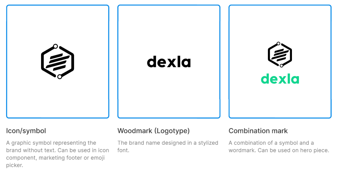
Dexla was scaling fast. New features shipped each cycle, and consistency was being argued from scratch every time. The only piece of brand that existed was the logo. The rest (typography, colour, spacing, controls) was case-by-case.
Toba joined during the early weeks and we built the system together. The challenge was less about visuals and more about agreement. With no shared vocabulary, every new screen meant a fresh debate. Cycles grew, repetition crept in, and the brand started feeling thinner each release.
Three things
the system had
to fix.
- P.01
No shared vocabulary. Designers, engineers, and stakeholders argued in fragments. There was no canonical button, no agreed spacing scale, no named tokens. Every cycle re-litigated the same decisions, and cycles got longer for it.
- P.02
The brand was a logo. Beyond the mark, nothing was defined. Type, colour, spacing, motion: all of it lived in whichever file shipped last. Recognition slipped from one release to the next.
- P.03
The builder propagated drift. Dexla is a no-code app builder, so any drift at the system layer multiplied through every app a customer shipped. The system had to hold for our product and for the apps built on top of it.
What we built,
and in what order.
We started with a competitive read of Material, Atlassian, and Wise. Useful for principles. Less useful for the question we actually had, which was how to build a system from scratch while the product was shipping new features each week. Published systems describe the rules they ended up with, not the order they arrived at them.
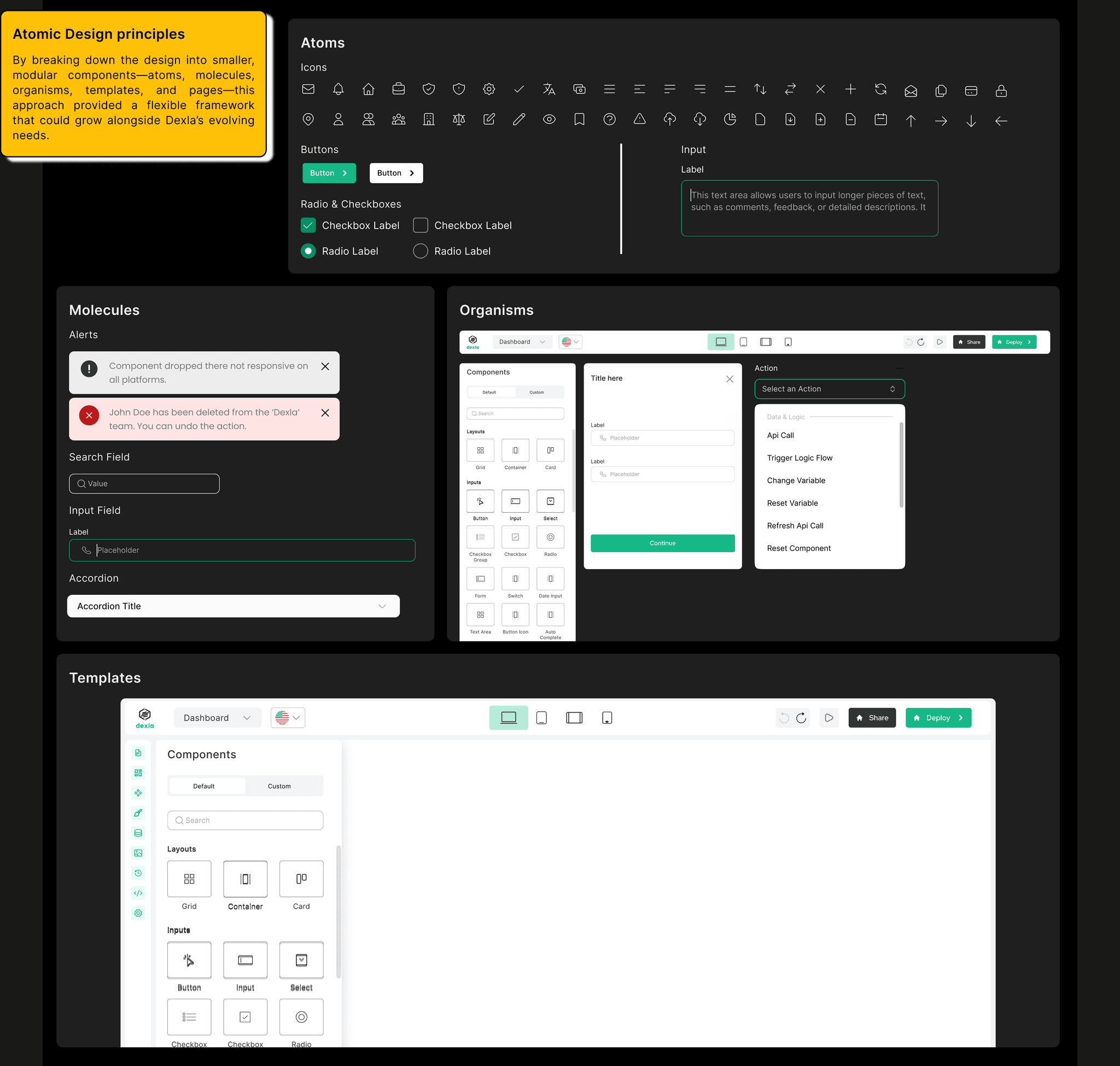
The style guide came first. Type ramp, colour, spacing scale, named tokens. Things that could be agreed in a room and then referenced in a comment thread. Atomic Design gave us the structure to grow into: primitives at the bottom, components in the middle, patterns at the top. Whatever we added later had a place to land.
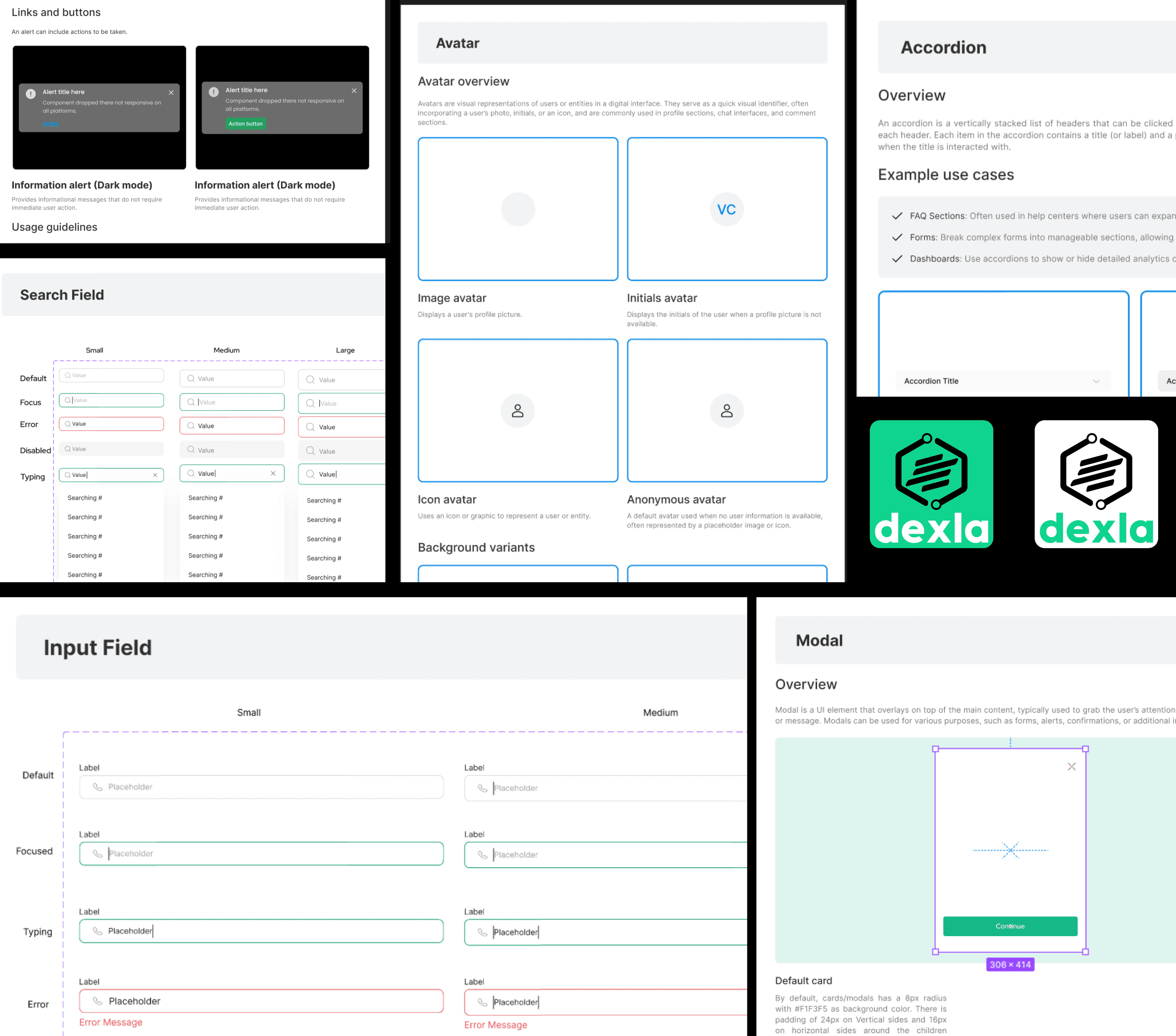
The component library followed. Buttons, input fields, modals, navigation bars, cards, in that order. The choice was not aesthetic, it was frequency of use across the product. A button decision touches more screens than a tooltip decision.
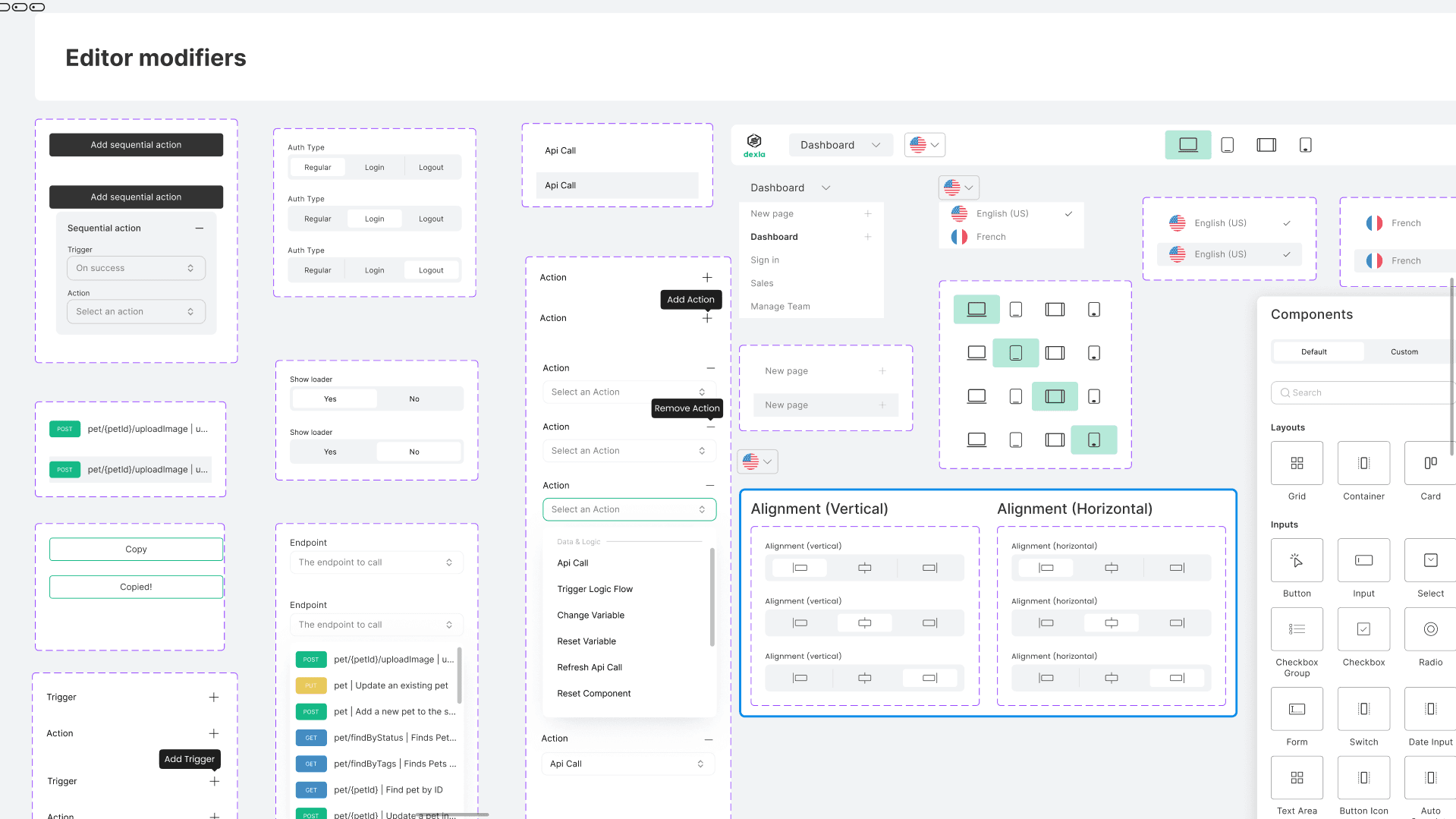
The no-code editor needed its own pass. Customers were building apps with Dexla, which meant components had to expose customisation surfaces (colour, copy, layout) without losing the constraints that kept the output recognisable. The same control had to behave in two contexts: ours, where the system was authoritative, and theirs, where the system was a starting point.
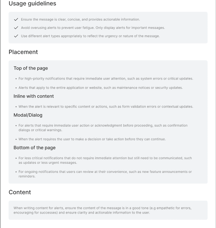
Documentation came last and lived where engineering already worked. In Notion. Each component got a page. Each token got a name and a reason.
What shipped.
The system landed as a style guide, a component library, no-code editor components, and a Notion site. Each piece linked to the next: component pages referenced the token names, token names referenced the style guide. The documentation lived where engineering already worked, which kept the system close to the people consuming it.
Where the deadline
showed.
The system was built while the product was shipping. That meant some primitives went out before their state coverage was complete. If I did this again I would treat documentation as part of a component’s release, not a sweep done afterwards.
The no-code editor pass is the part I would want to spend more time on. Customising a component without breaking the brand is its own design problem, and one round was the budget we had.